Thursday, December 4, 2008
Opening Credits Sequence
This is my opening credits sequence I to make for my computer image making class.
Sunday, November 23, 2008
Movie Poster

For our latest training exercise in my computer image making class we we asked to create a movie poster. I chose to do a movie poster for a real film I made in my 16mm production class.
Enjoy!
Sunday, October 26, 2008


For our next computer image making assignment we are asked to create a DVD menu for a DVD displaying our work. The first step was to create a photoshop document for our main menu page. We then displayed them for the class and received valuable feed back.
Most of the class claimed the first thing their eye was drawn to was the colored mosaic in the middle of my document. They claimed their eyes rested on center cluster as well, which I found very interesting. They said they wanted to click on play first, which is what I intended, and then it was divided between the next three buttons. This is what I wanted because playing the actual films would be most important and the other three would rest closely behind.
My fellow classmates also seemed very intrigued by the color scheme and design. They said it was very easy to navigate and worked well. The only thing they noticed was that the title was difficult to read and suggested adjusting it for better readability.
The title is definitely one thing I plan to improve for the final DVD menu. I will most likely use the burn tool in photoshop to make it stand out more. I will also try incorporating things from other films into the menu to make the focus more than just one film and maybe use the burn tool on the buttons to make them stand out a bit more as well.
Monday, October 6, 2008
"Catch" the Opening Credits Sequence


Recently we were asked to analyze and opening credits sequence in my computer image making class. For my presentation I chose the opening credits for "Catch Me if you Can". I found this sequence very unique and stand alone. I believe much about the story in the credits and the film is conveyed through this sequence and it is also very entertaining. I presented my analysis to the class on October 2, 2008.
Typography


For my first project in computer image making, we were asked to convey meaning through numerous text samples using our typography skill.
My first example is of the saying "The American Dream". For this one I wanted big bold lettering because of the boldness of the statement. I decided to add pictures to fill the image. I started out with money because most people believe that is everyone's dream: to be rich. I then filled the next section with a family because I believe that is truly what people really want someone who cares about them: what's money going to do for you when you're alone? The last section is filled with a spotlight because I believe America was built on a free society and thus, the American Dream is truly what you make it.
My second example is of "Global War on Terror". I decided to make war bright, large, and bursting through the other three words because when people hear any statement with war, all they really hear is War. I then made terror black harsh lettering and falling because people see it as a scary thing, but can't pinpoint what terror relates to the war, so it kind of falls away from the statement. I made Global bubbly because it is globe like and smaller because I don't believe it is truly a Global war. Not everyone is fighting it.
My final example is "Aids Apathy is Lethal". For this one I really wanted to highlight the horror of lethal because I believe that is the strongest statement and most memorable word to get the message across. Thus, I stuck it in the middle in blood like lettering. I capitalized the a and l because it is almost all, suggesting that all apathy is lethal.
Sunday, October 5, 2008
Replication
 Original Ad
 My Replica
To better my post production skills, I am taking a computer image making class. For our first exercise we were asked to replicate a print ad using photoshop. At first I was a little bit concerned because of my limited use with photoshop. But, through my experience I became more knowledgeable about the tools in photoshop.
The top one is the original ad and the bottom is the replica I created. I used a lot of paint tools to create the legs and feet. I also, used the magic wand to try and match colors and the shape of the body. finding the text was difficult, but I scrolled through my options to find the closed match and then used kerning and tracking to match the original text.
This is Me
My name is Kirk Torgerson and I am a film and video major at Grand Valley state University. I have learned much while at Grand Valley. I have had the opportunity to use equipment and resources that have advanced my filmmaking. However, my filmmaking goes back much further than Grand Valley.
I first discovered my love of film in middle school when my friends and I began going to the movies at least once a week. We soon began to make our own videos using my parent’s old Video Cassette camcorder. We acted in them and filmed them. Most of them were comedy skits.
It was high school where I really realized this could be a career. Since I went to a small school, a friend and I formed our own independent study film class and made a film for our final project.
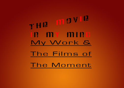
I have grown so much through my film experiences and I hope this blog will allow me to expose my work. Also, I aim to discuss my experiences with other films and related topics.
I first discovered my love of film in middle school when my friends and I began going to the movies at least once a week. We soon began to make our own videos using my parent’s old Video Cassette camcorder. We acted in them and filmed them. Most of them were comedy skits.
It was high school where I really realized this could be a career. Since I went to a small school, a friend and I formed our own independent study film class and made a film for our final project.
I have grown so much through my film experiences and I hope this blog will allow me to expose my work. Also, I aim to discuss my experiences with other films and related topics.
Subscribe to:
Posts (Atom)


