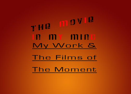


For my first project in computer image making, we were asked to convey meaning through numerous text samples using our typography skill.
My first example is of the saying "The American Dream". For this one I wanted big bold lettering because of the boldness of the statement. I decided to add pictures to fill the image. I started out with money because most people believe that is everyone's dream: to be rich. I then filled the next section with a family because I believe that is truly what people really want someone who cares about them: what's money going to do for you when you're alone? The last section is filled with a spotlight because I believe America was built on a free society and thus, the American Dream is truly what you make it.
My second example is of "Global War on Terror". I decided to make war bright, large, and bursting through the other three words because when people hear any statement with war, all they really hear is War. I then made terror black harsh lettering and falling because people see it as a scary thing, but can't pinpoint what terror relates to the war, so it kind of falls away from the statement. I made Global bubbly because it is globe like and smaller because I don't believe it is truly a Global war. Not everyone is fighting it.
My final example is "Aids Apathy is Lethal". For this one I really wanted to highlight the horror of lethal because I believe that is the strongest statement and most memorable word to get the message across. Thus, I stuck it in the middle in blood like lettering. I capitalized the a and l because it is almost all, suggesting that all apathy is lethal.


No comments:
Post a Comment